MO BAR
2019 — 2020
Branding, Art Direction, Design
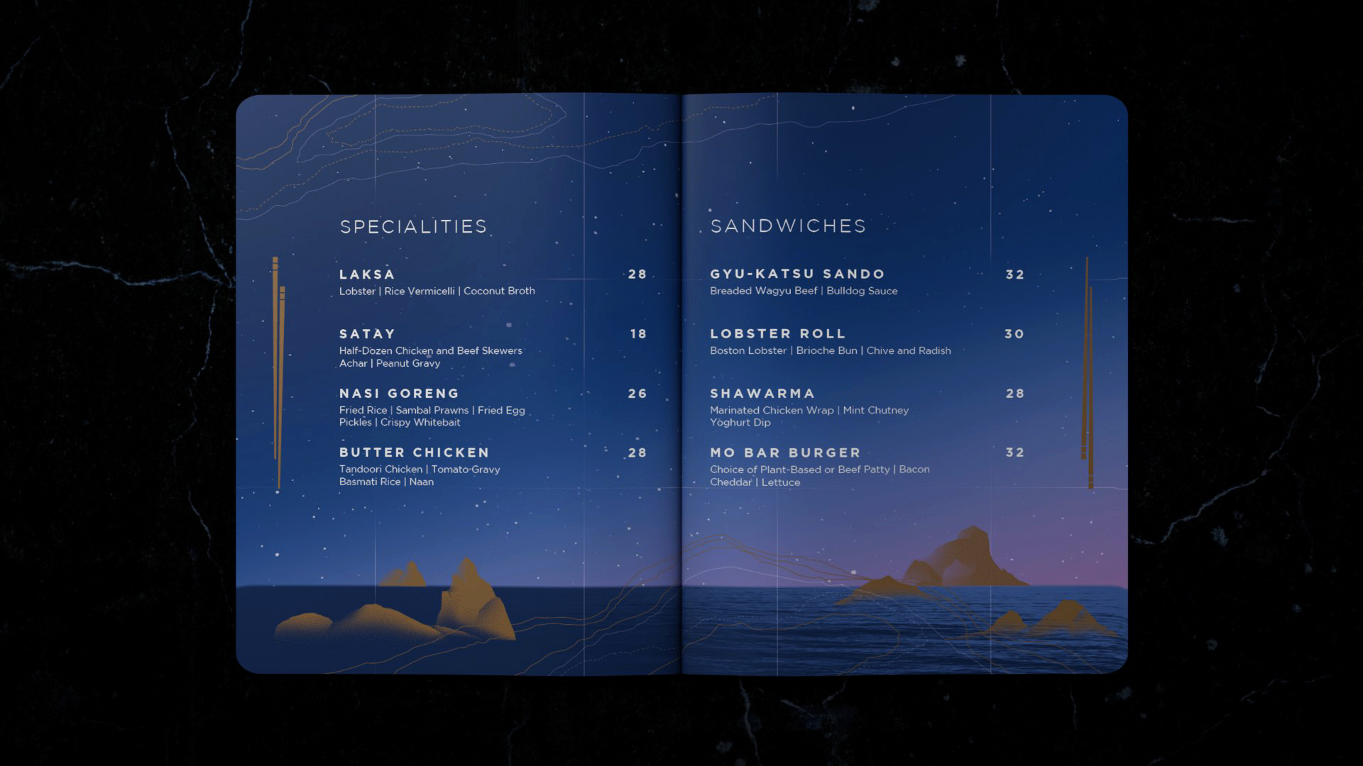
MO BAR is a concept located at Mandarin Oriental, Singapore. Inspired by the Pacific Ocean and rich culture of Asia’s ports, MO BAR presents a new experience to celebrate the flavours and aromas of the region.
Client: Mandarin Oriental
Agency: ACRE Design
︎ Creative Circe Awards (GONG) 2019
Agency: ACRE Design
︎ Creative Circe Awards (GONG) 2019
- Bronze: Printed Communication Design
- Bronze: Design Craft - Art Direction
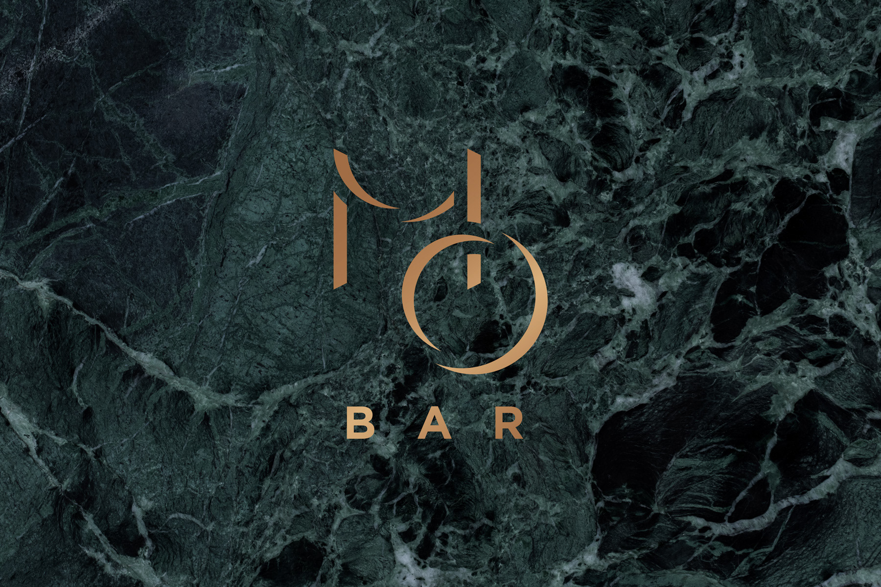
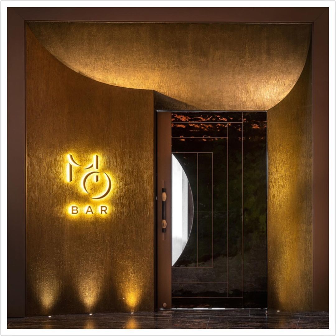
The logo is formed by an elegant arrangement of the letters “MO”, inspired by themes of light and shadow on celestial bodies.
︎ MO BAR Singapore
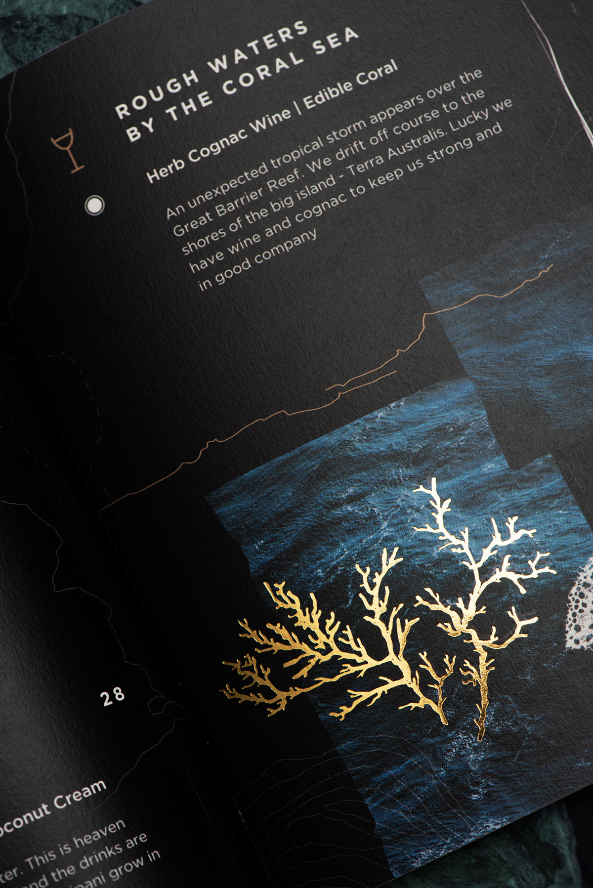
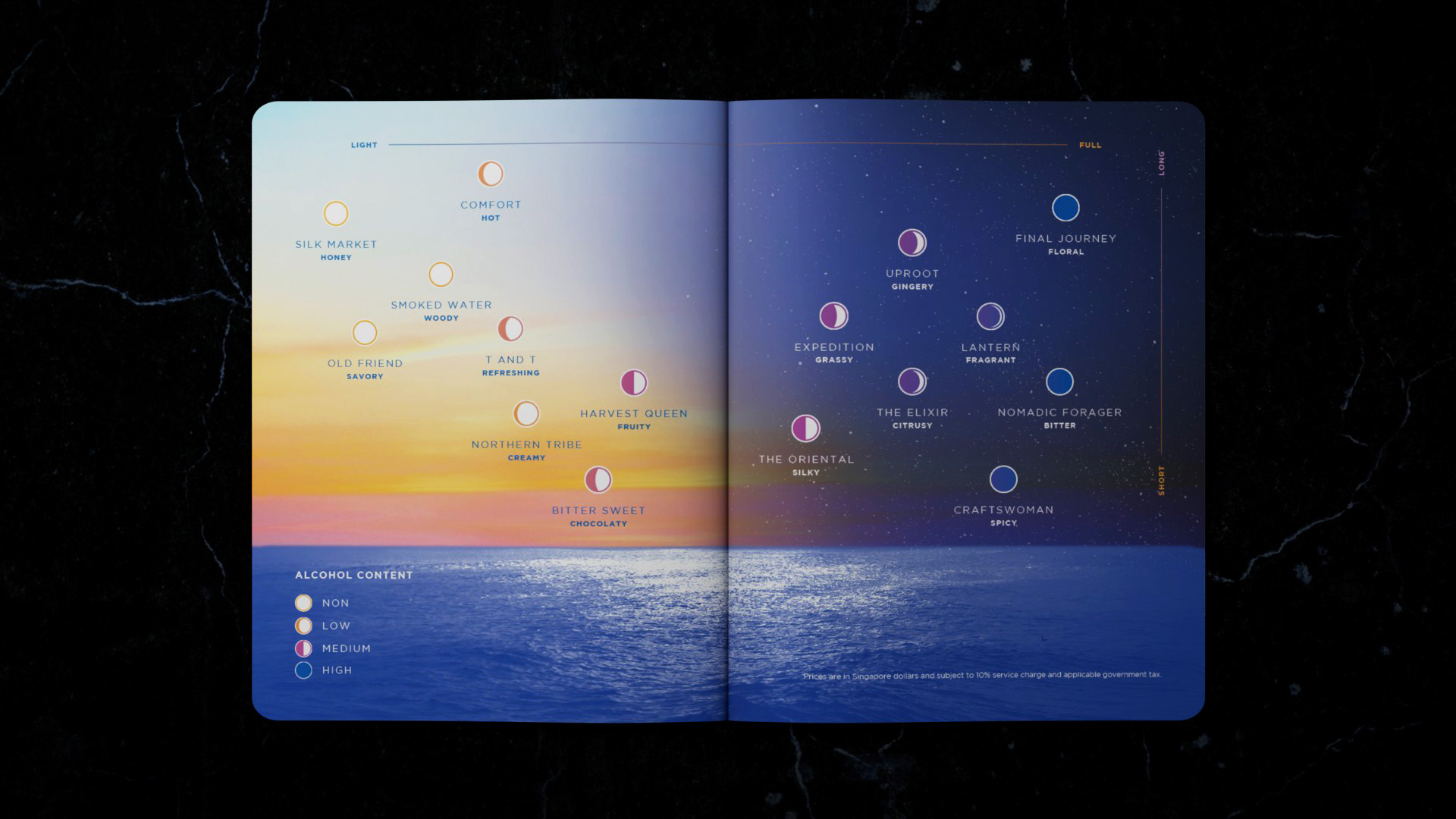
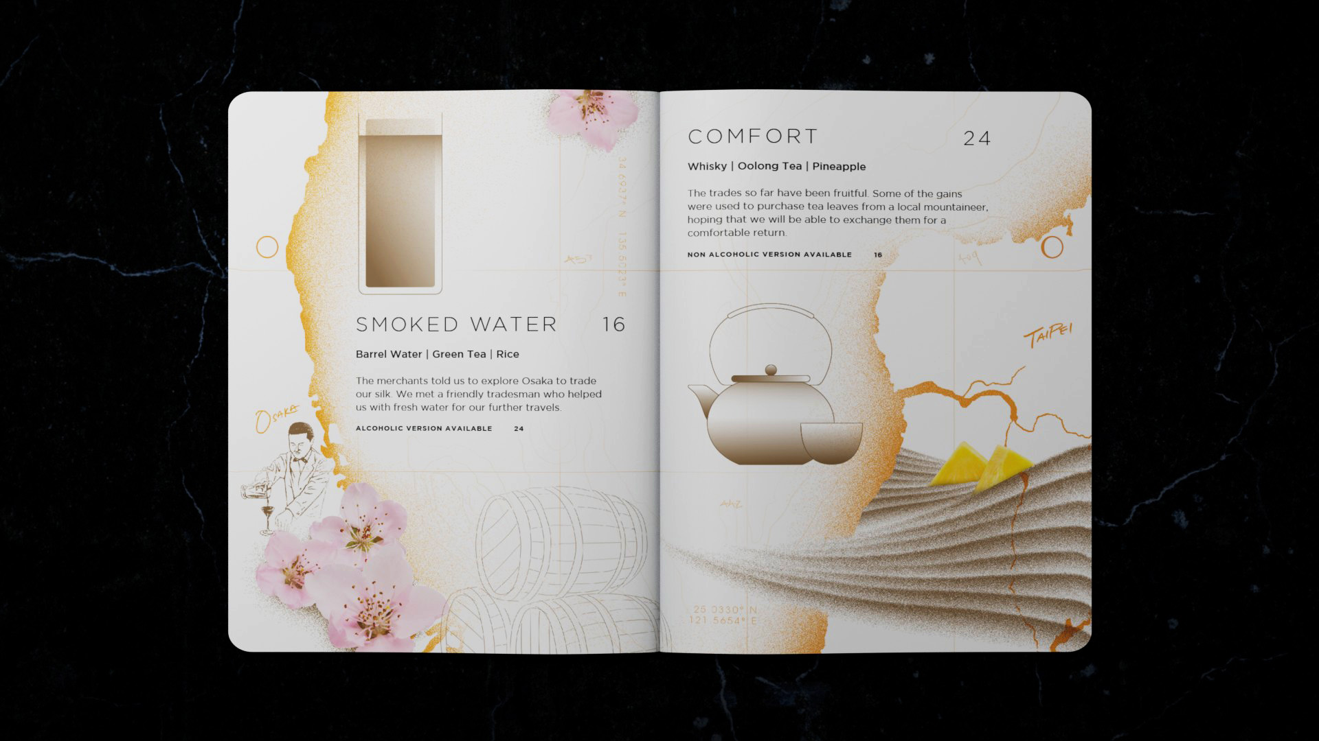
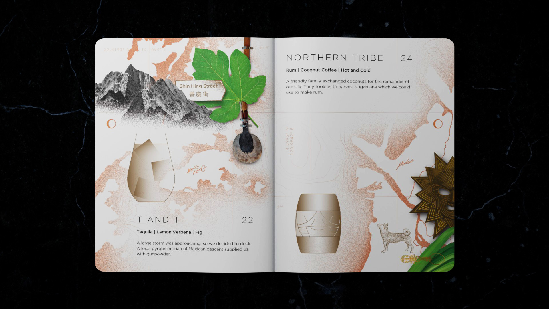
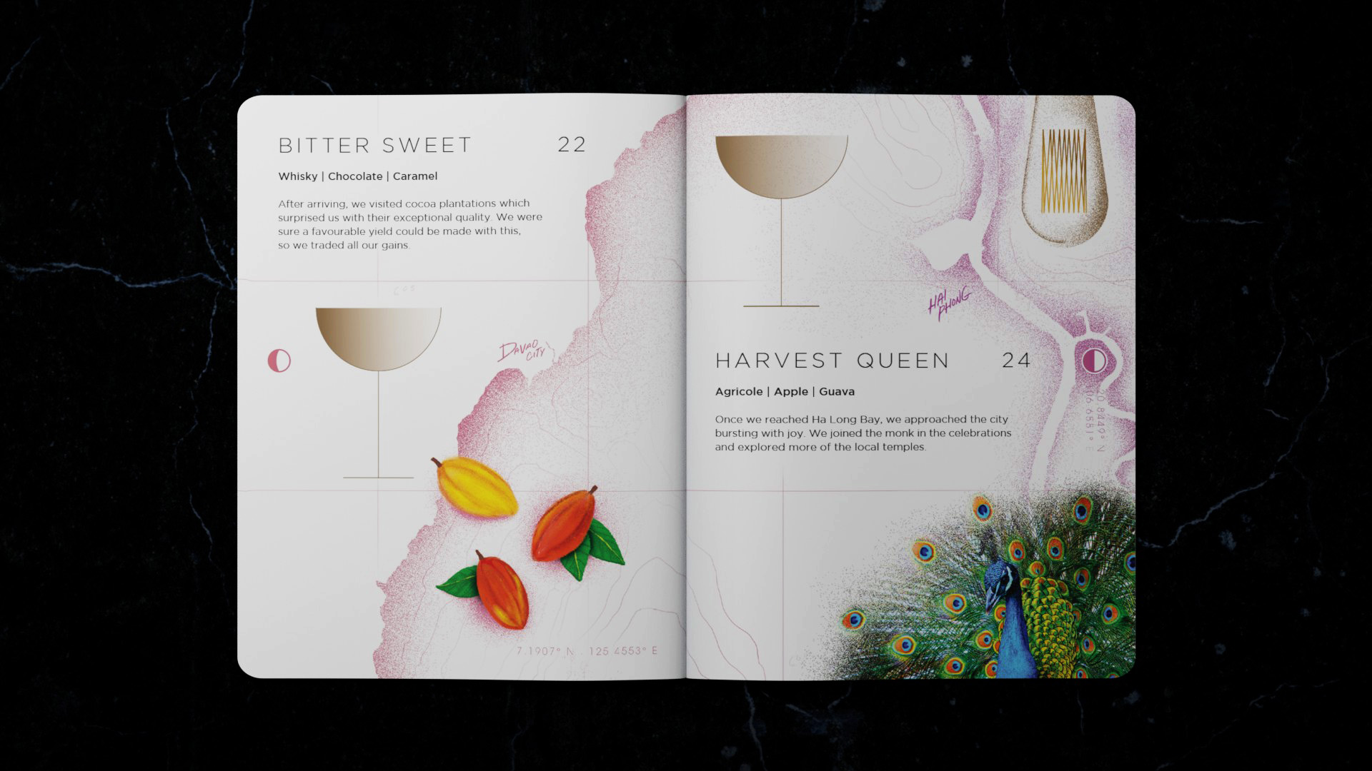
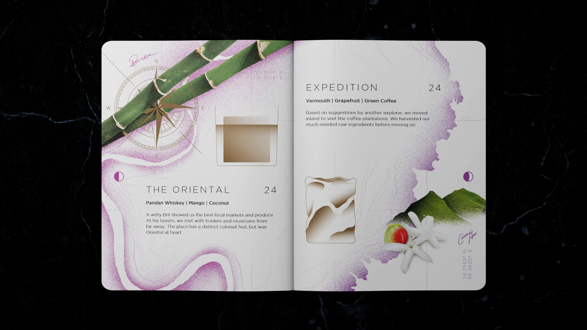
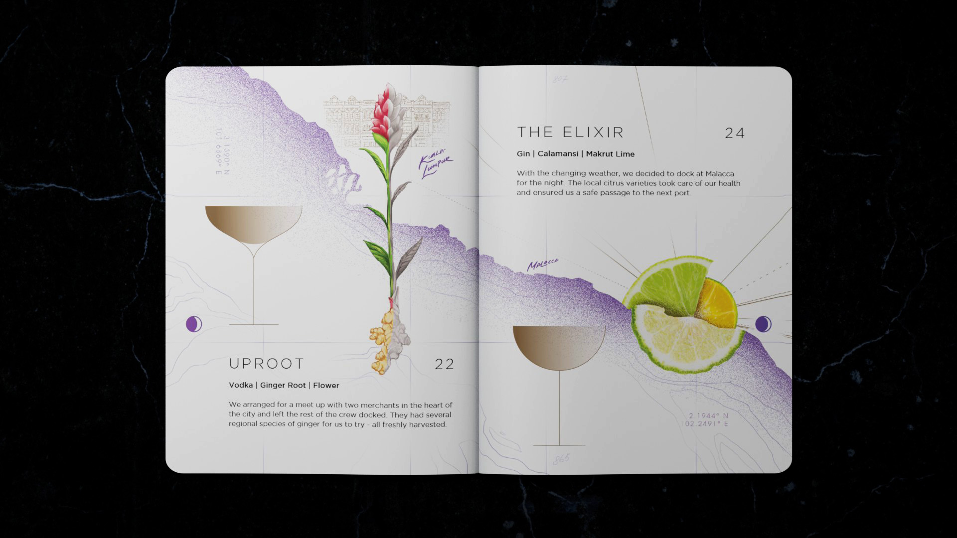
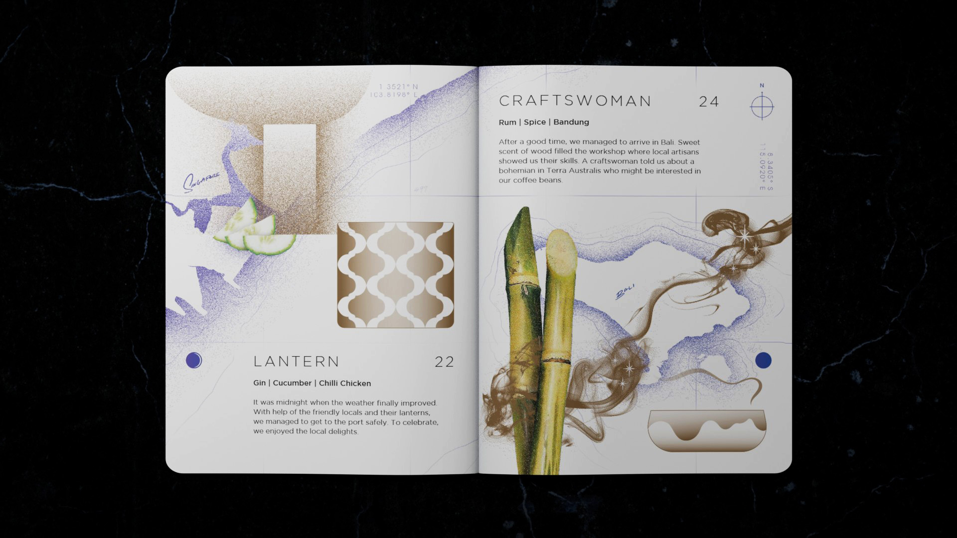
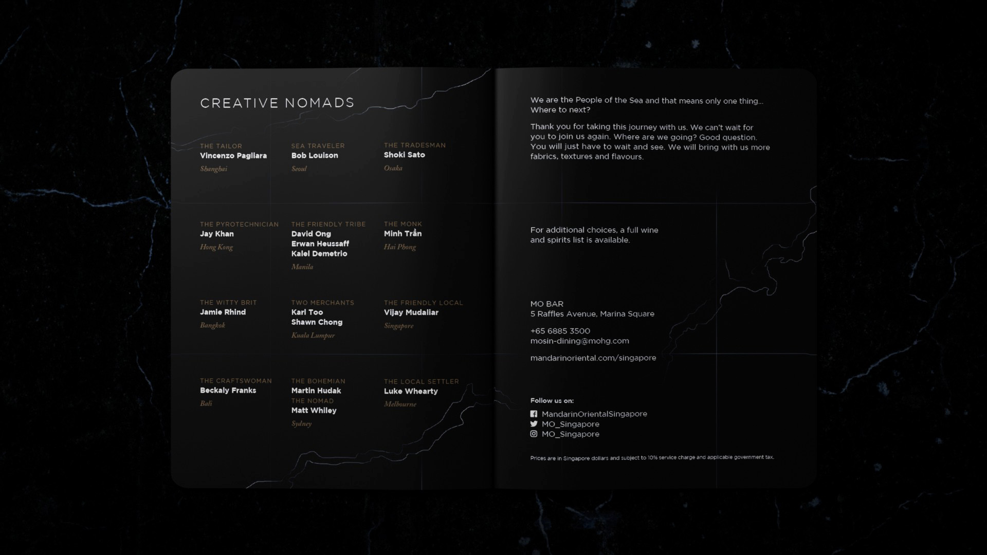
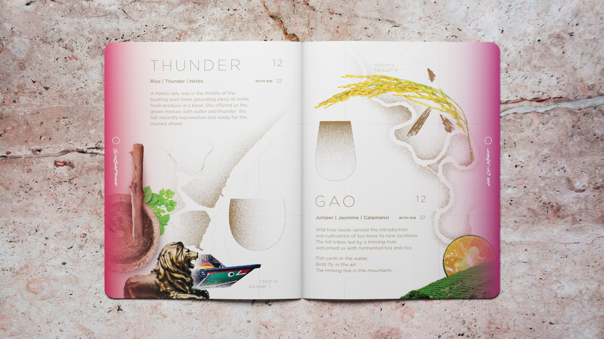
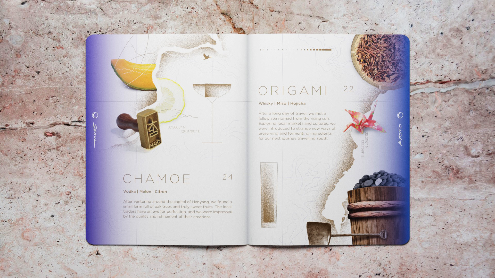
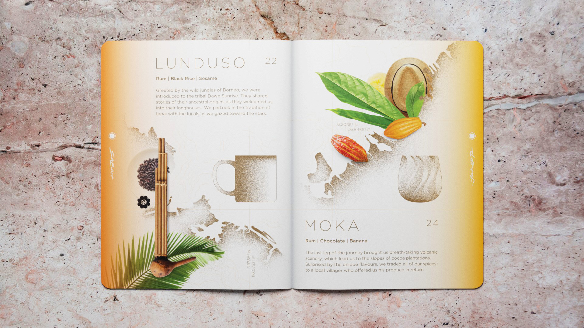
The menu is formatted in a handy booklet, highlighting the fourteen speciality cocktails developed exclusively by the bar.

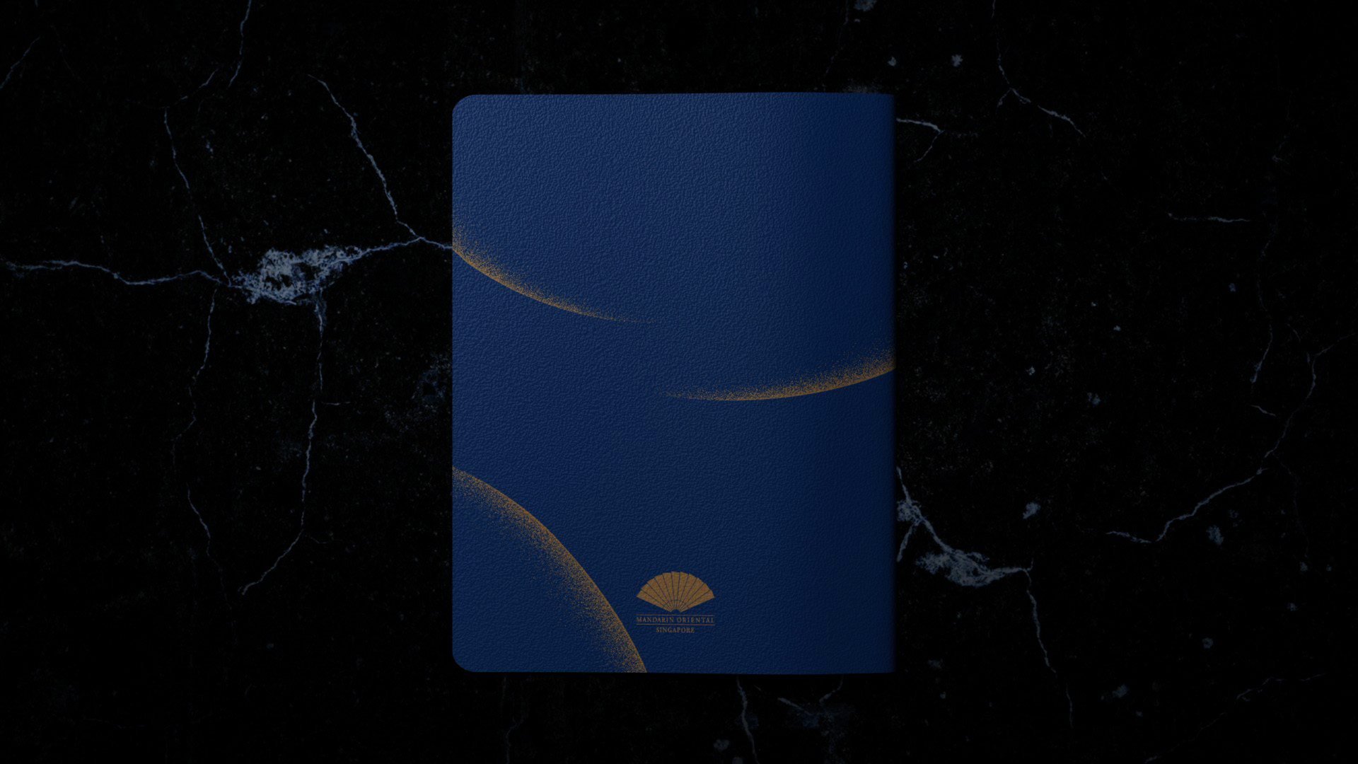
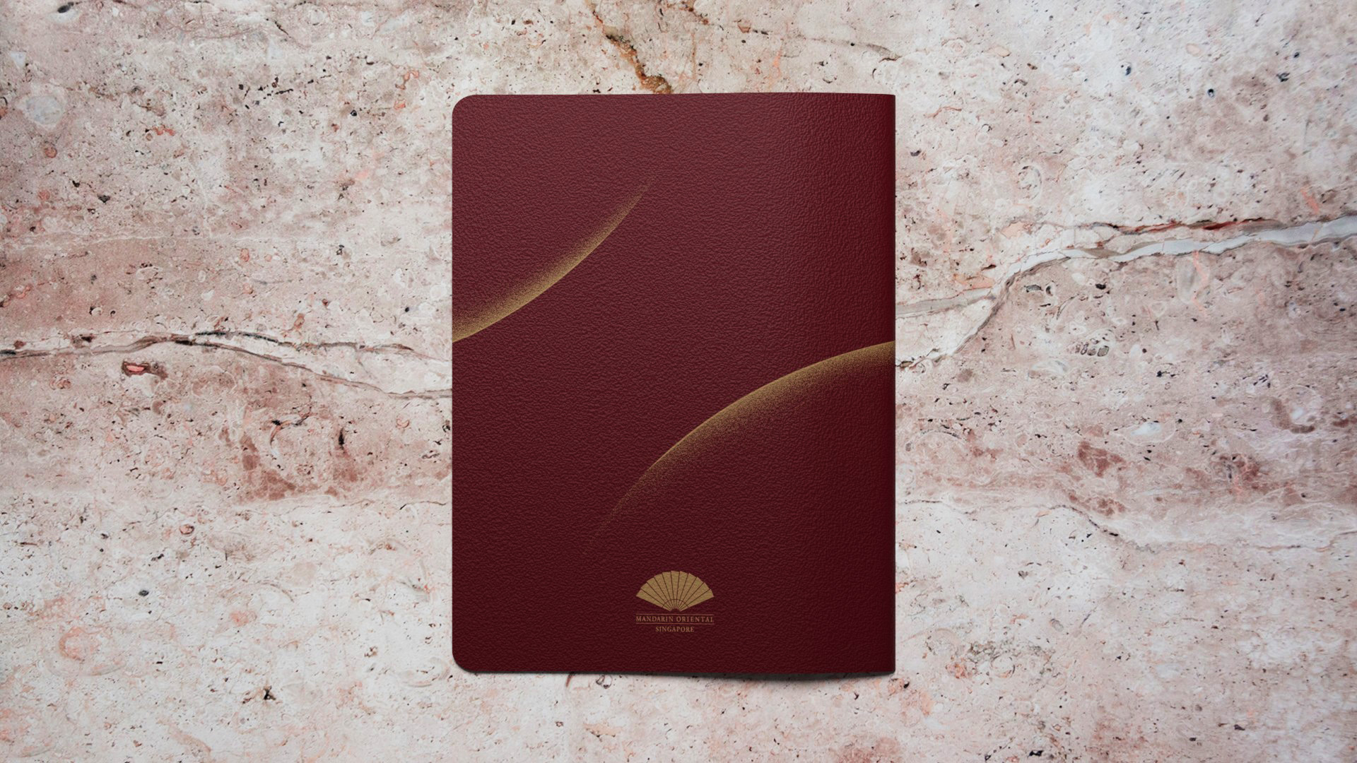
MO BAR Menu Volume 1, 2 and 3
MO BAR Menu :
Volume 1
2019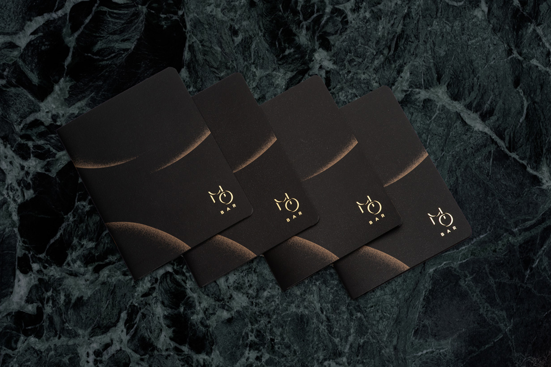

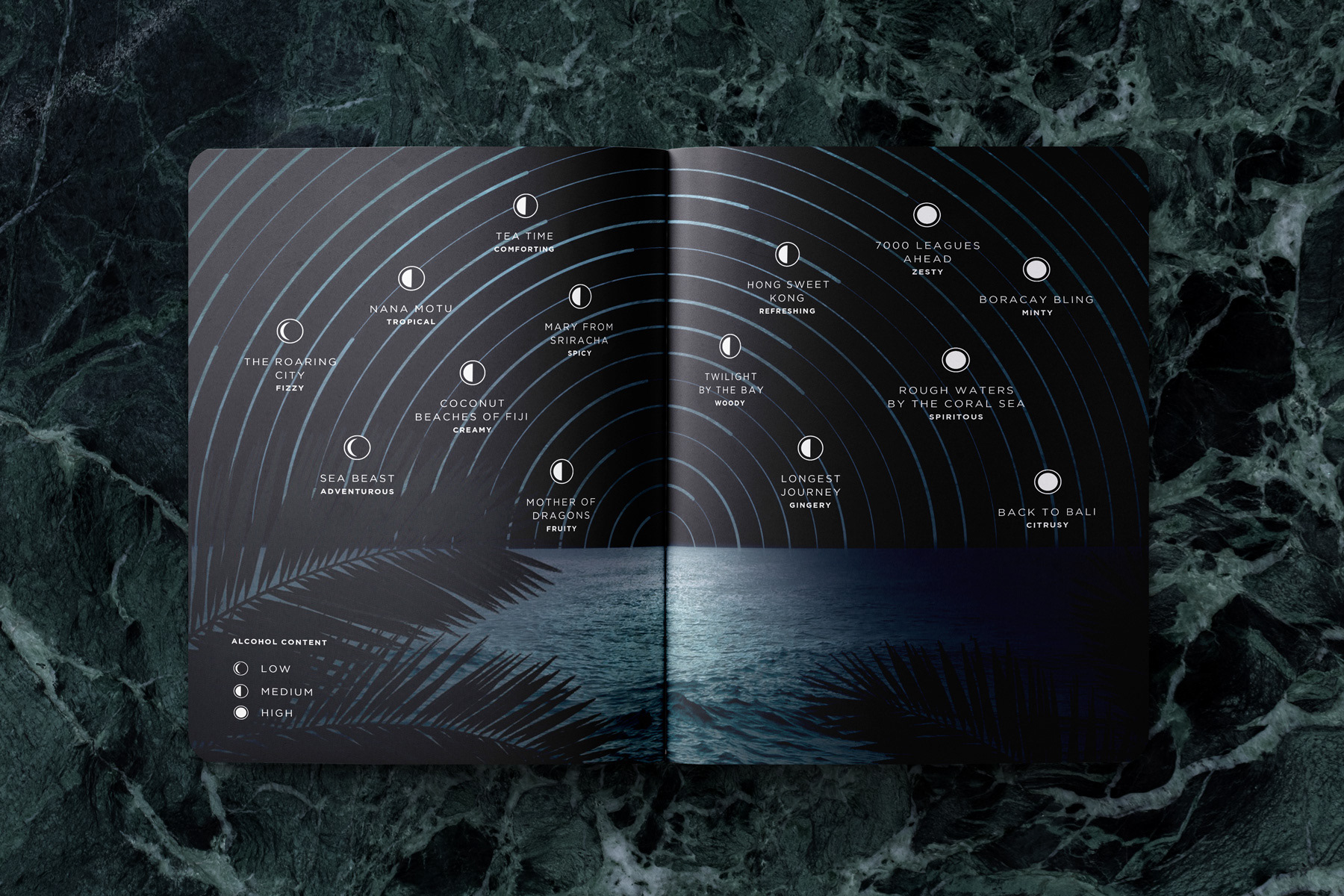
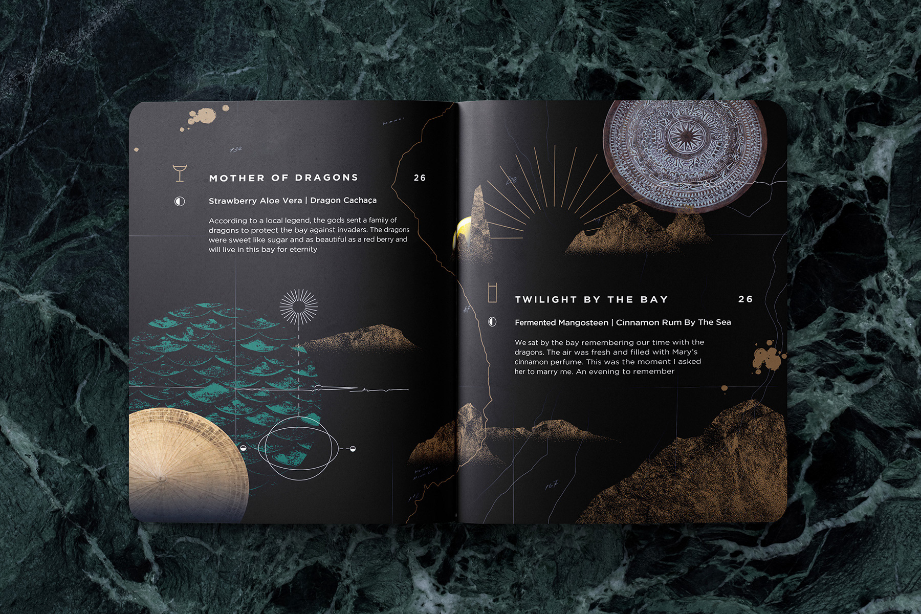

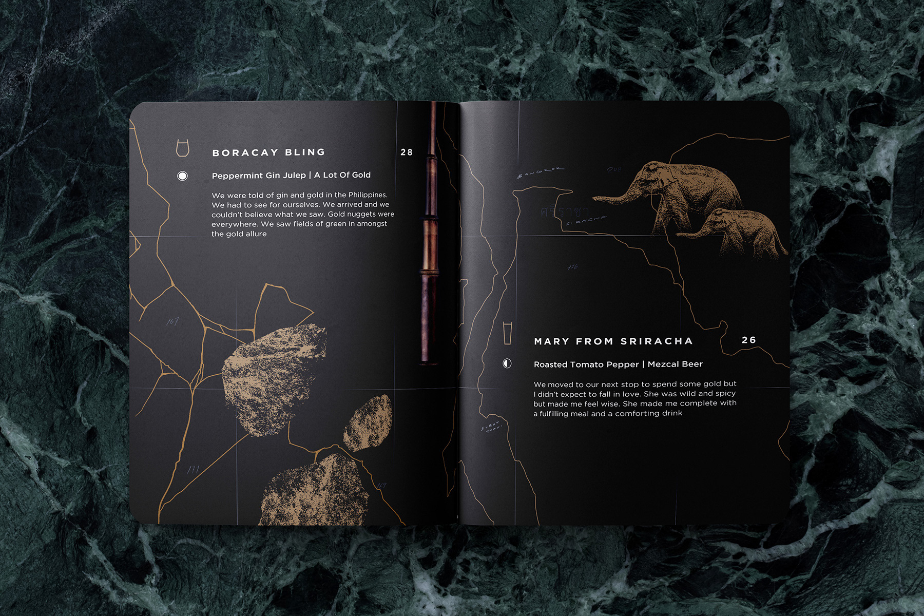
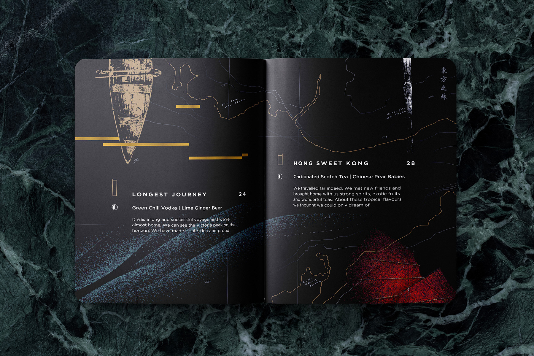
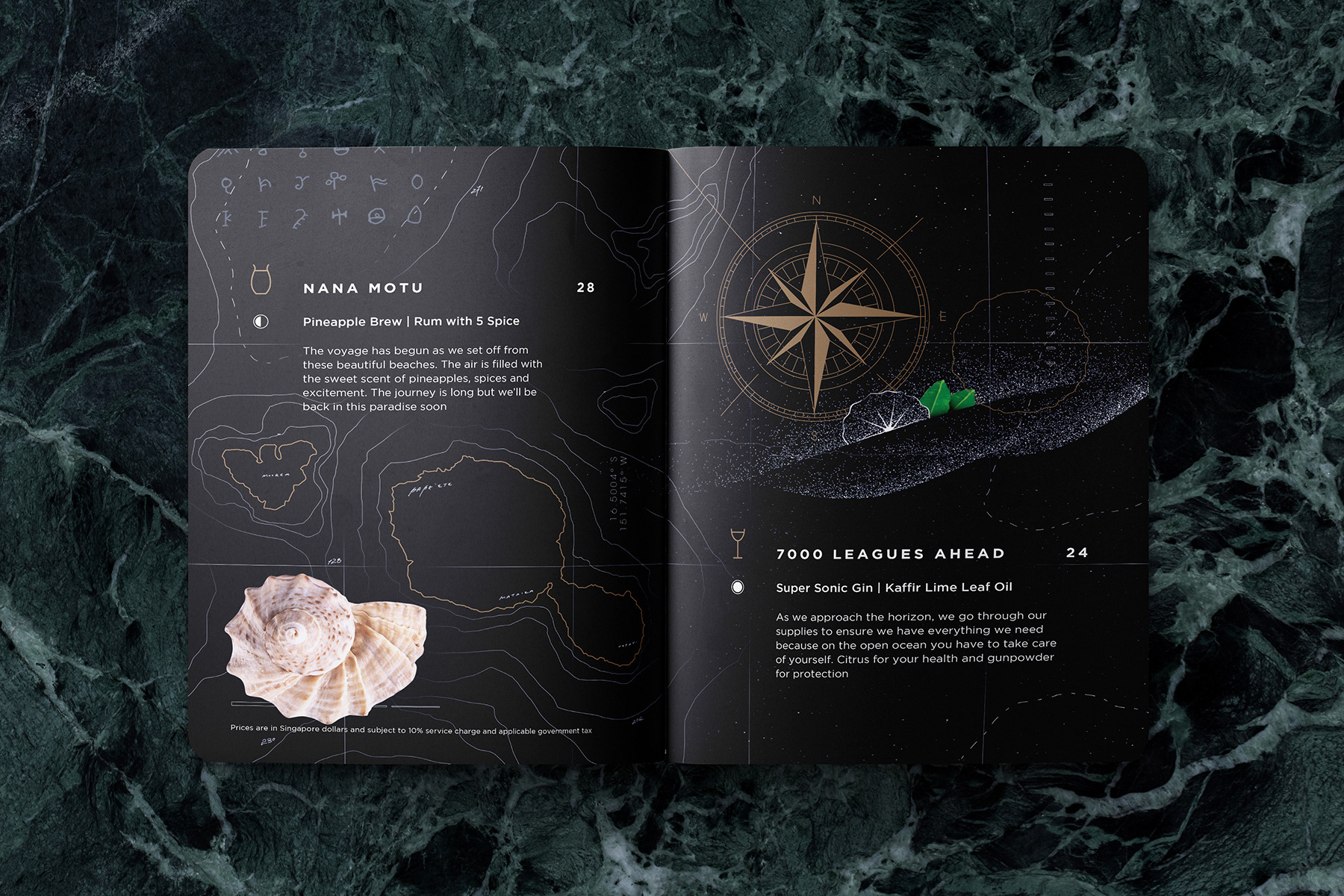
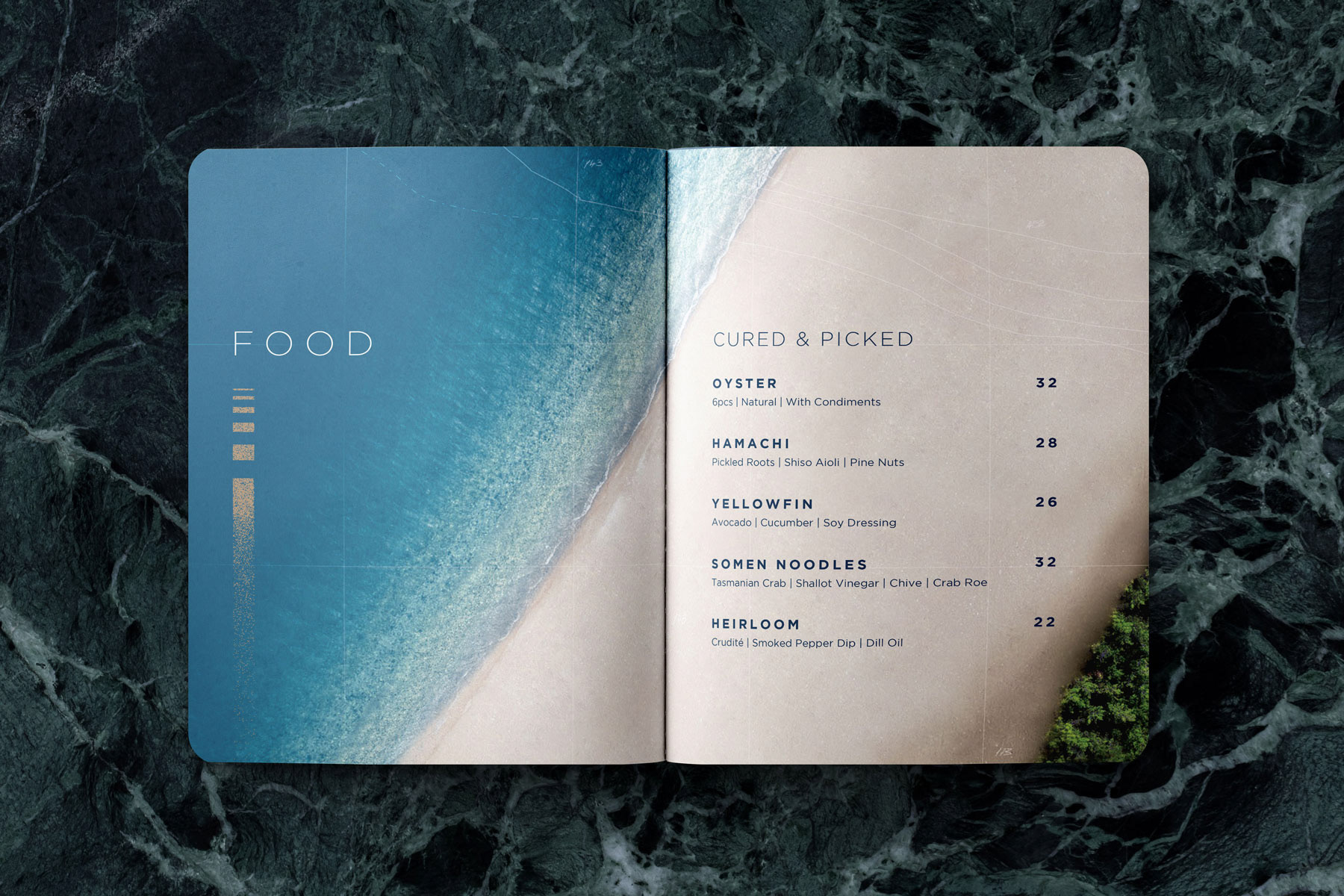
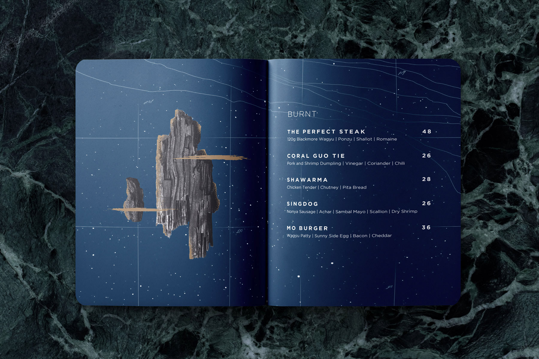
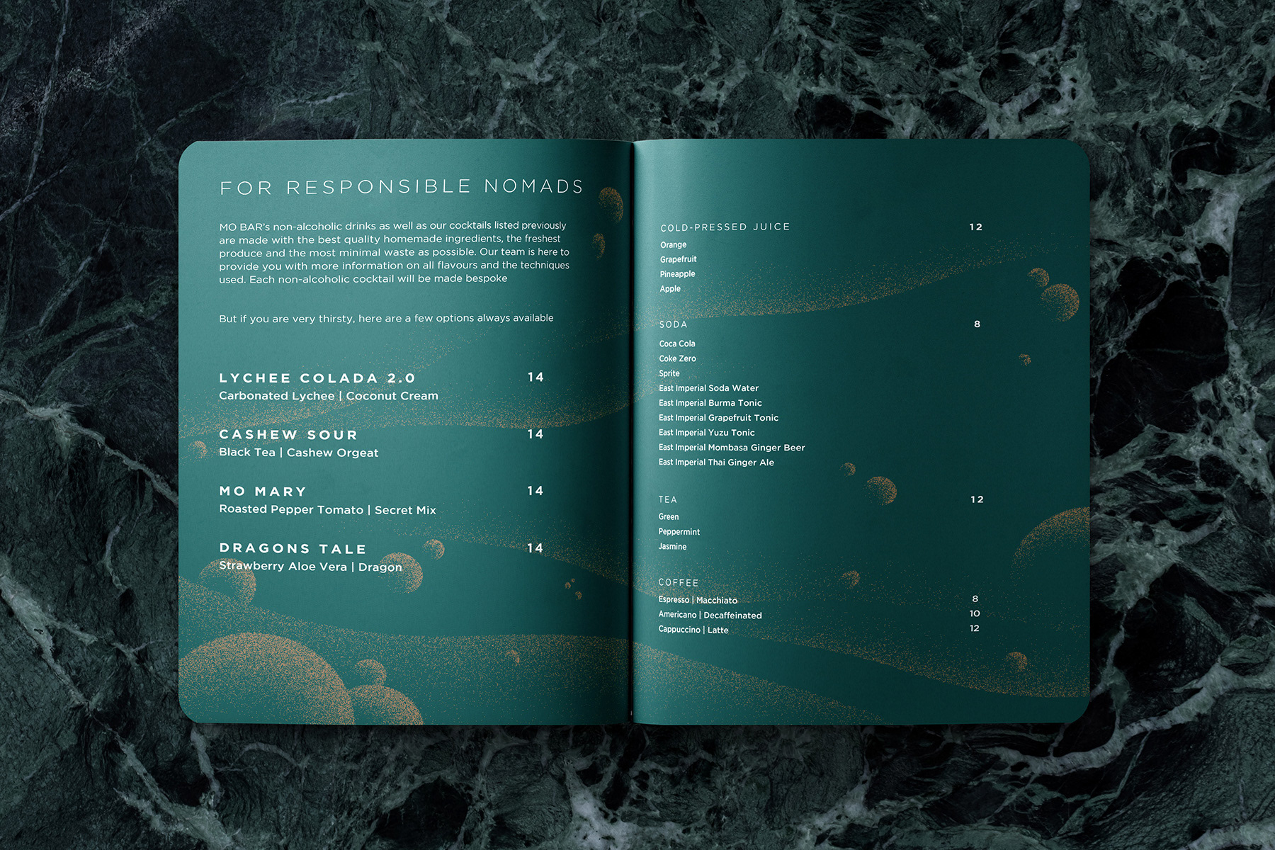
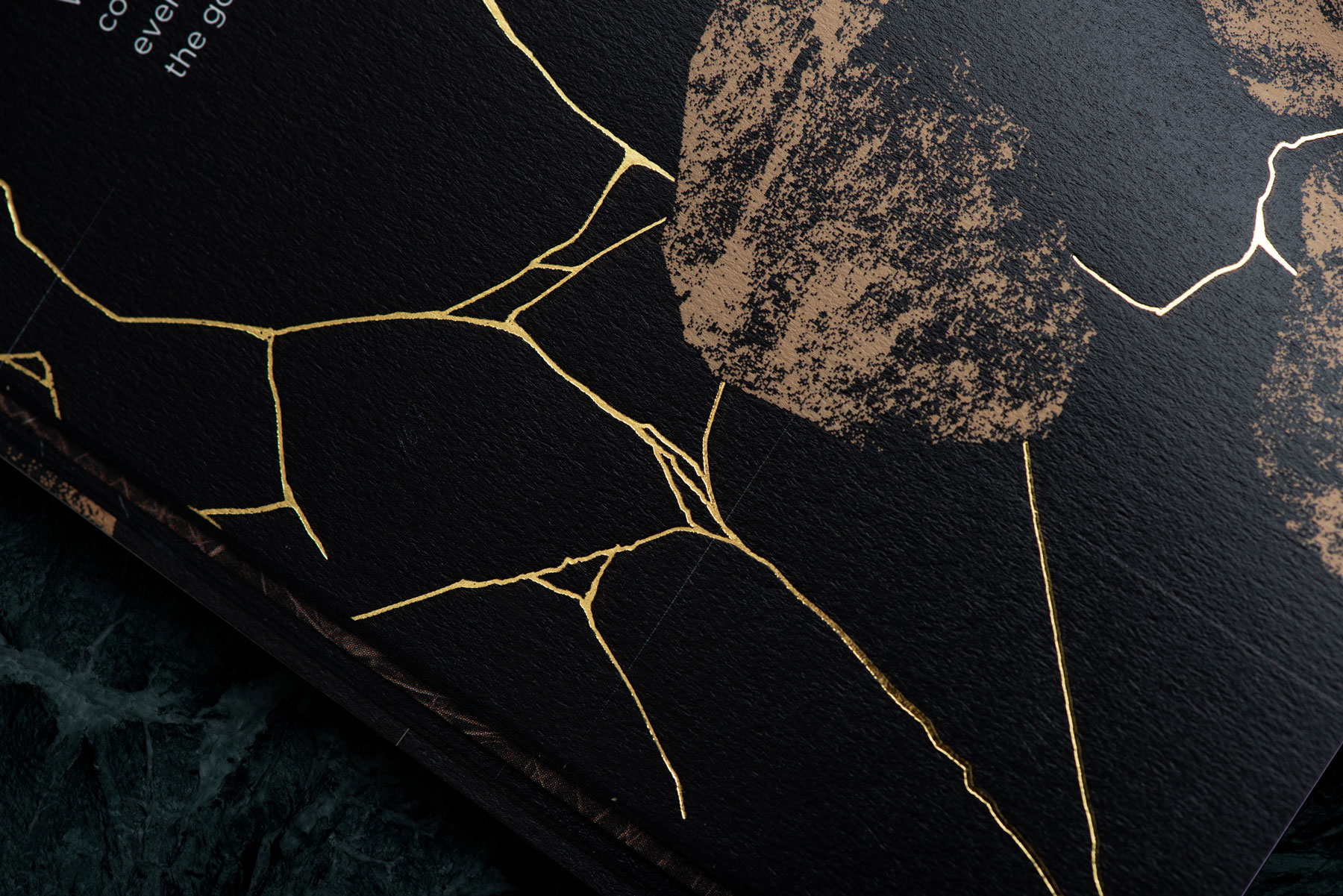
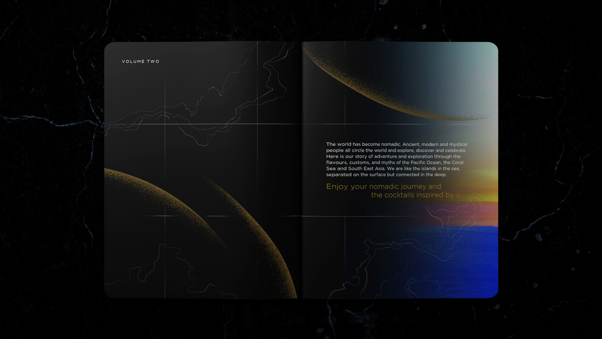
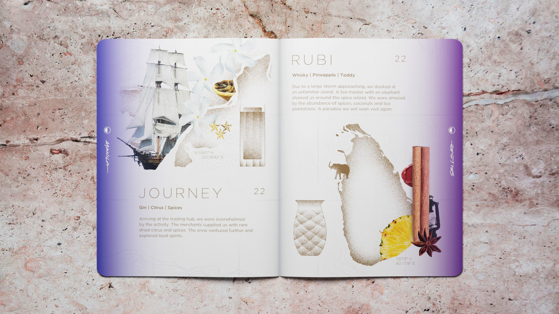
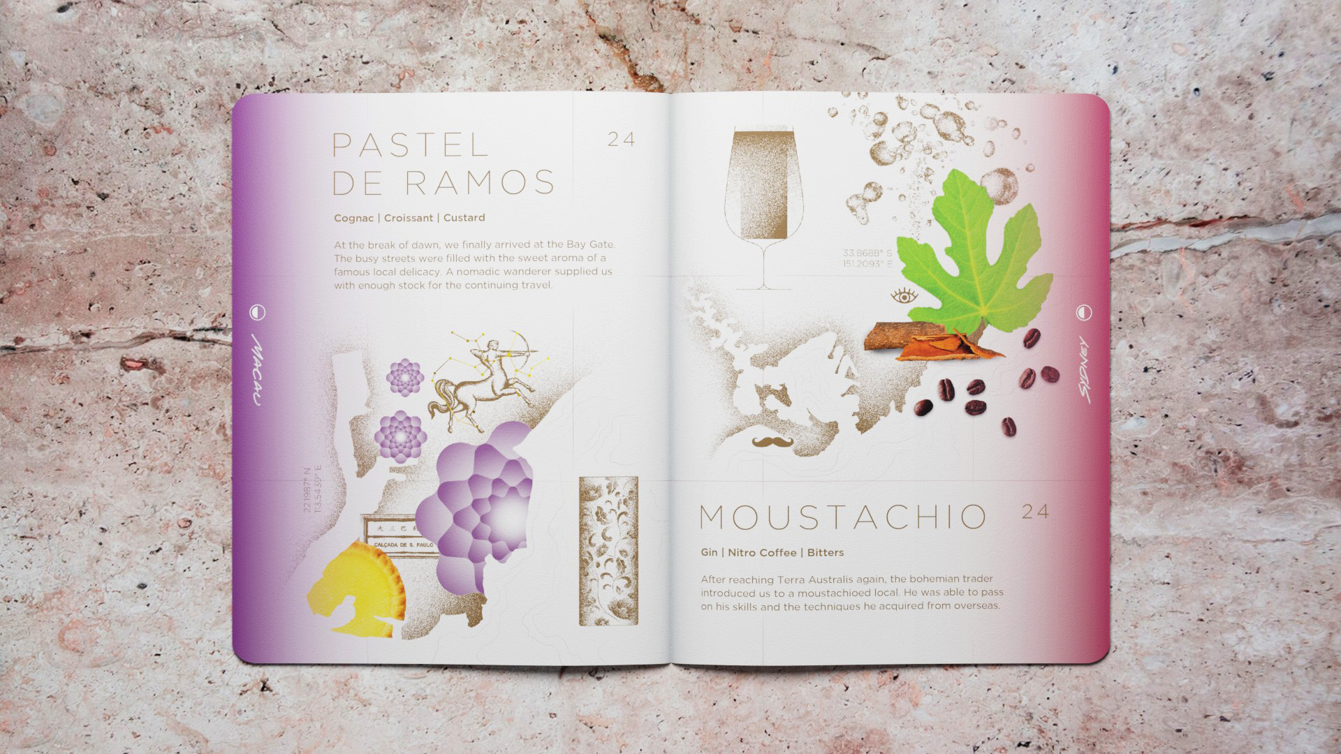
The elements found across the food, drinks, space and collaterals were based on an imagined future of the sea nomad peoples.
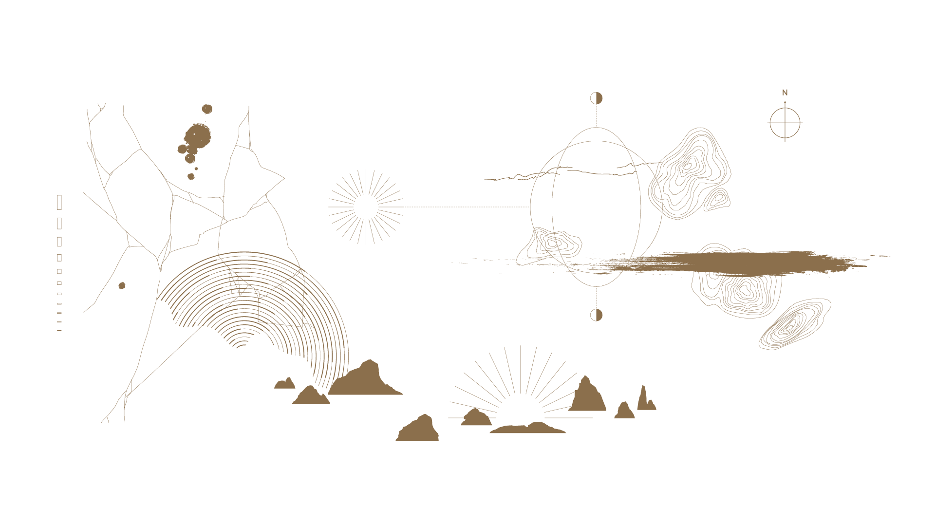
Themes of the Sea, Exploration, Astronomy and Artefacts are represented across the brand.

MO BAR Menu :
Volume 2
2019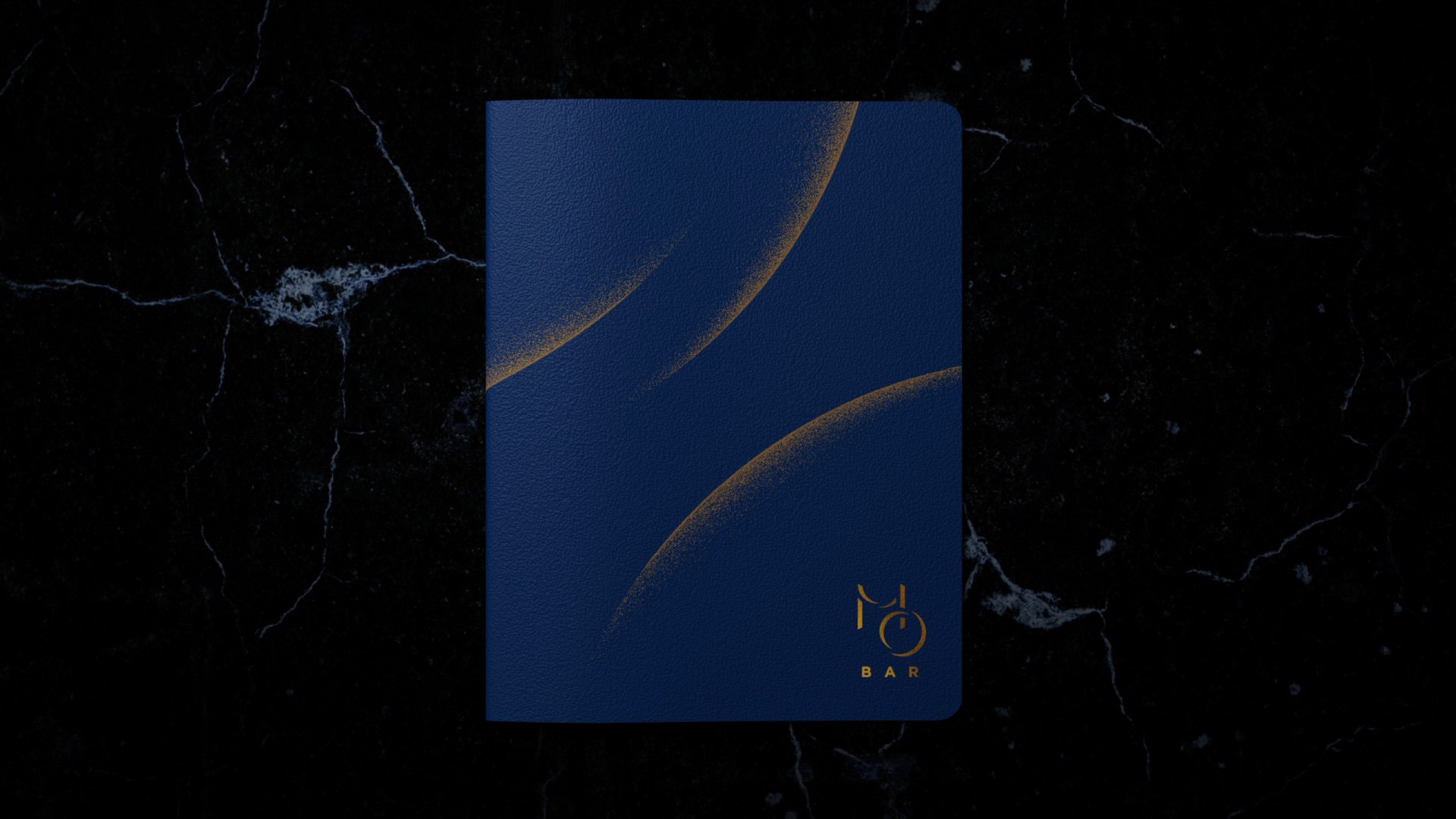


MO BAR Menu :
Volume 3
2020
Volume 3
2020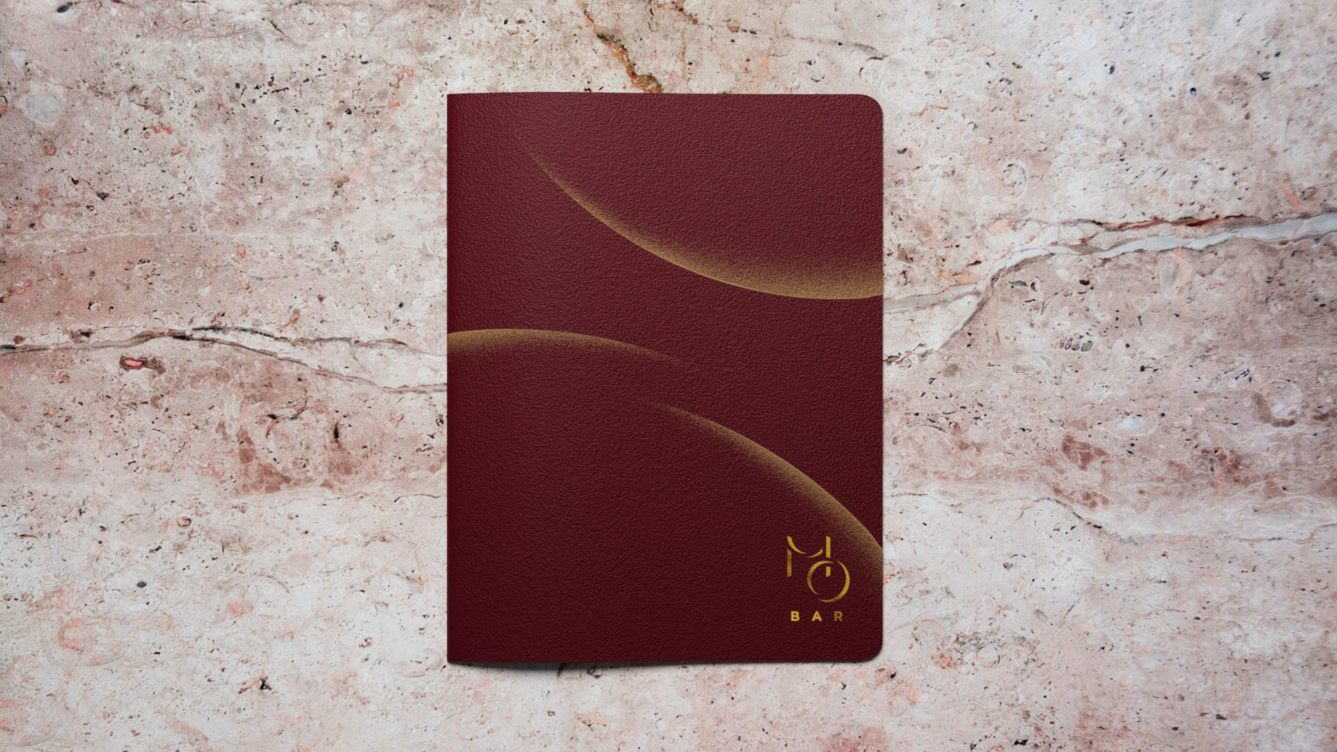


 ︎ MO BAR Singapore
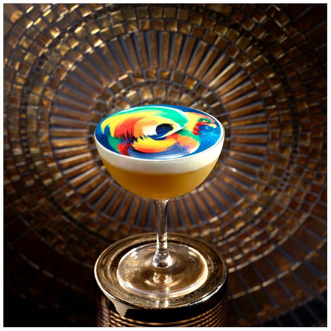
Sarimanok
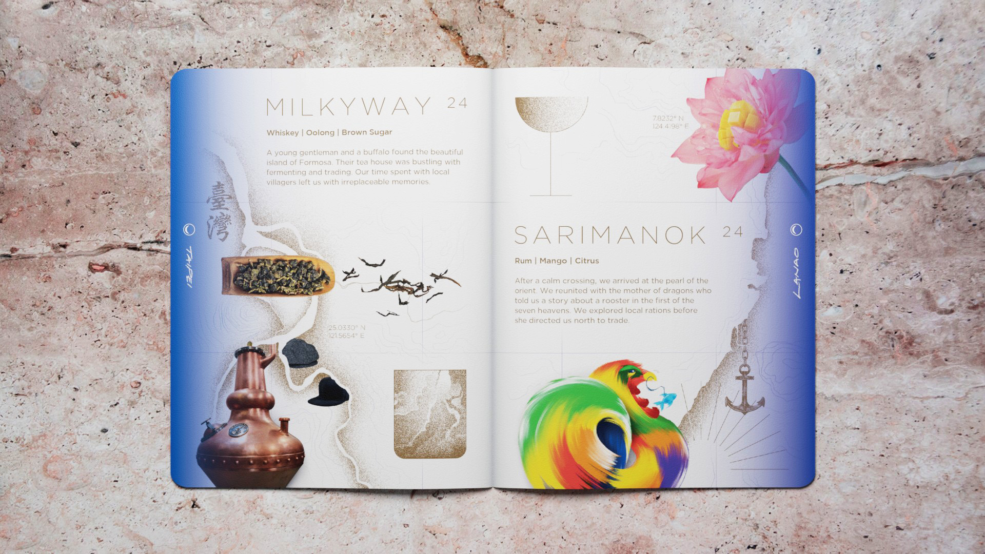
Along the journey, we were excited to illustrate a colourful Sarimanok, representing a part of Philippine mythology, to be showcased on the “Sarimanok” cocktail.

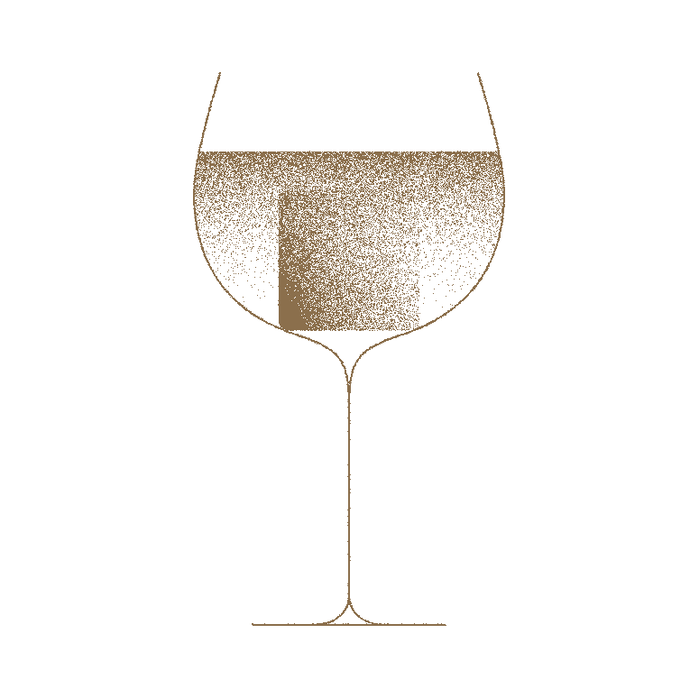
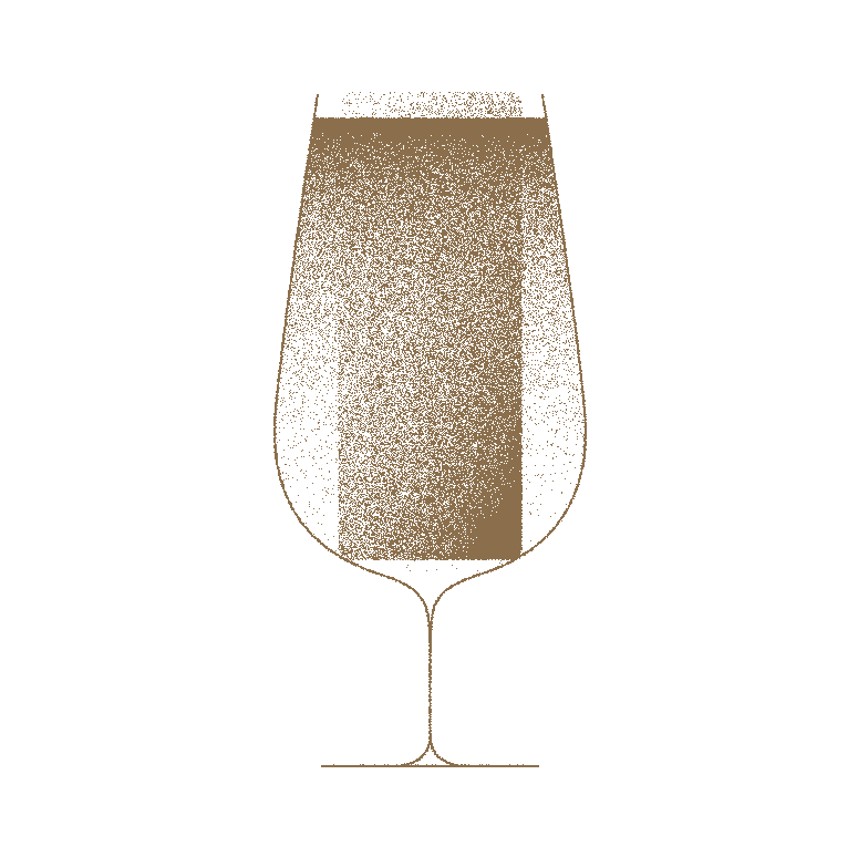
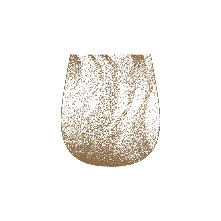
Vessels
We created icons in simple, yet elegant, line art style with dissolved gradient fills to represent a series of vessels that were carefully curated by MO BAR for the menu.