One Two Eat
2024Branding, Art Direction, Environmental
Client: One Two Eat
Agency: ACRE Design
It’s no secret—people don’t really like eating at food courts. You’d find youth at fast food joints and the elderly getting their kopi-o gao fix at hawker centres anyday. When our client’s teenage daughter started refusing to go to food courts, she approached us to co-create a new brand that would bring young and old together.

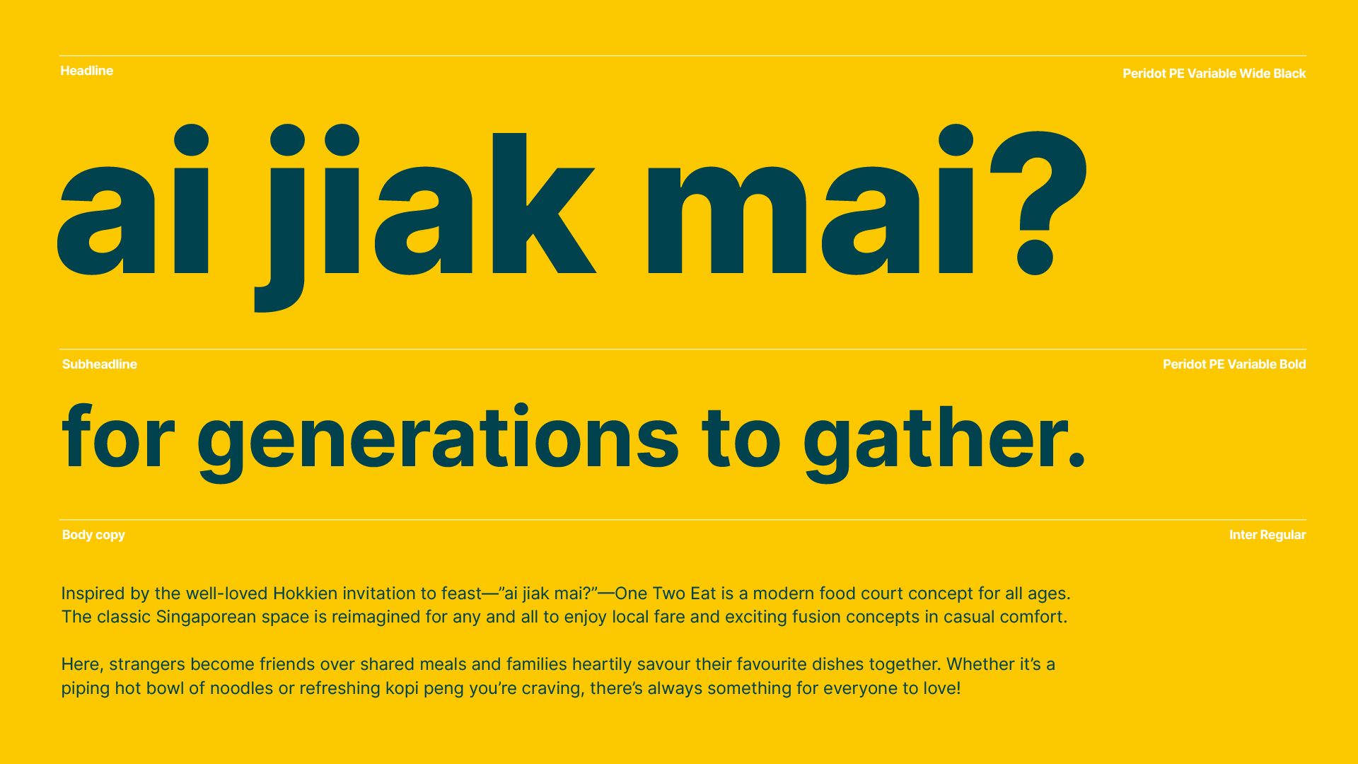
Reimagining the food court space for generations to gather

An inclusive brand for an inclusive community
Since good food is a hygiene factor in a foodie nation, we wanted to create a modern, halal food court brand centered around the pillars of being inclusive, casual, and affordable—all qualities close to our client’s heart. The name “One Two Eat” was inspired by the well-loved Hokkien invitation to feast—”ai jiak mai?”—which was simple enough for everyone to remember and connect with.
Since good food is a hygiene factor in a foodie nation, we wanted to create a modern, halal food court brand centered around the pillars of being inclusive, casual, and affordable—all qualities close to our client’s heart. The name “One Two Eat” was inspired by the well-loved Hokkien invitation to feast—”ai jiak mai?”—which was simple enough for everyone to remember and connect with.
Wayfinding icons for the elderly
The signature bowl logomark was extracted and adapted to different food icons to showcase the curated food vendors at a One Two Eat food court. Keeping the elderly in mind, these icons could also be used as simple wayfinding for elderly to find different stalls.
![]()
The signature bowl logomark was extracted and adapted to different food icons to showcase the curated food vendors at a One Two Eat food court. Keeping the elderly in mind, these icons could also be used as simple wayfinding for elderly to find different stalls.


Youthful. Fun. Passionate.
In order to make the brand more youthful, we introduced the Peridot PE Variable font that could be used to create digital assets for the food court’s many screens. Optimised for readability, bold and wide-black weights were selected so that elderly customers could easily read stall signs and menus. The brand’s inclusive tone-of-voice was also expressed in the typography, where colloquial phrases and different translations were used to appeal to a diverse group of customers.
In order to make the brand more youthful, we introduced the Peridot PE Variable font that could be used to create digital assets for the food court’s many screens. Optimised for readability, bold and wide-black weights were selected so that elderly customers could easily read stall signs and menus. The brand’s inclusive tone-of-voice was also expressed in the typography, where colloquial phrases and different translations were used to appeal to a diverse group of customers.


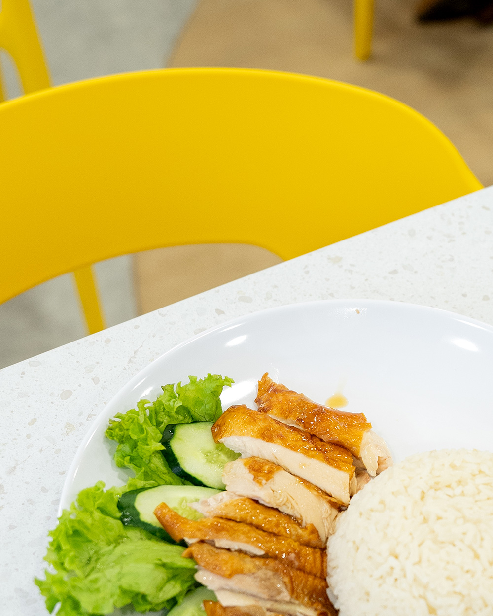
A space that feels like home
Together with our partner interior designer and contractors, we ensured that our palette of 6 pop-art inspired colours were implemented in major interior design features like counter tiling and dining chairs. Everything from the suspended lights to the table laminate went through a vigorous selection process to bring the brand’s warmth and homely qualities to life.
Together with our partner interior designer and contractors, we ensured that our palette of 6 pop-art inspired colours were implemented in major interior design features like counter tiling and dining chairs. Everything from the suspended lights to the table laminate went through a vigorous selection process to bring the brand’s warmth and homely qualities to life.


For the cherry on the top, human illustrations were added to ensure that the overall design language would feel more relatable. These were most prominently featured in a centrepiece mural design that showed people of different ages, races, and backgrounds coming together to eat.

Written above the central mural, the brand essence “for generations to gather” embodies our client’s inclusive, community-building vision. At One Two Eat, strangers become friends over shared meals and families heartily savour their favourite dishes together. Whether it’s a piping hot bowl of noodles or refreshing kopi peng you’re craving, there’s always something for everyone to love.
